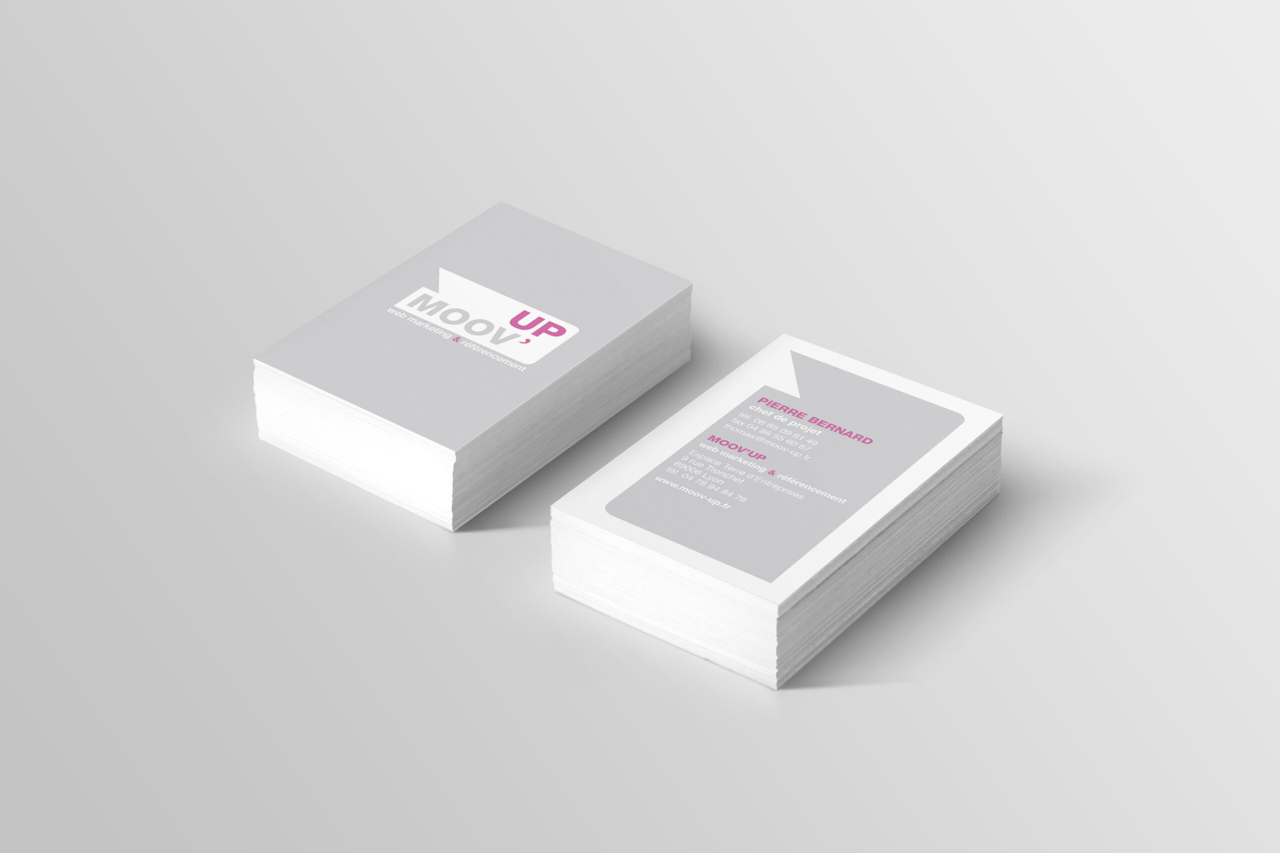
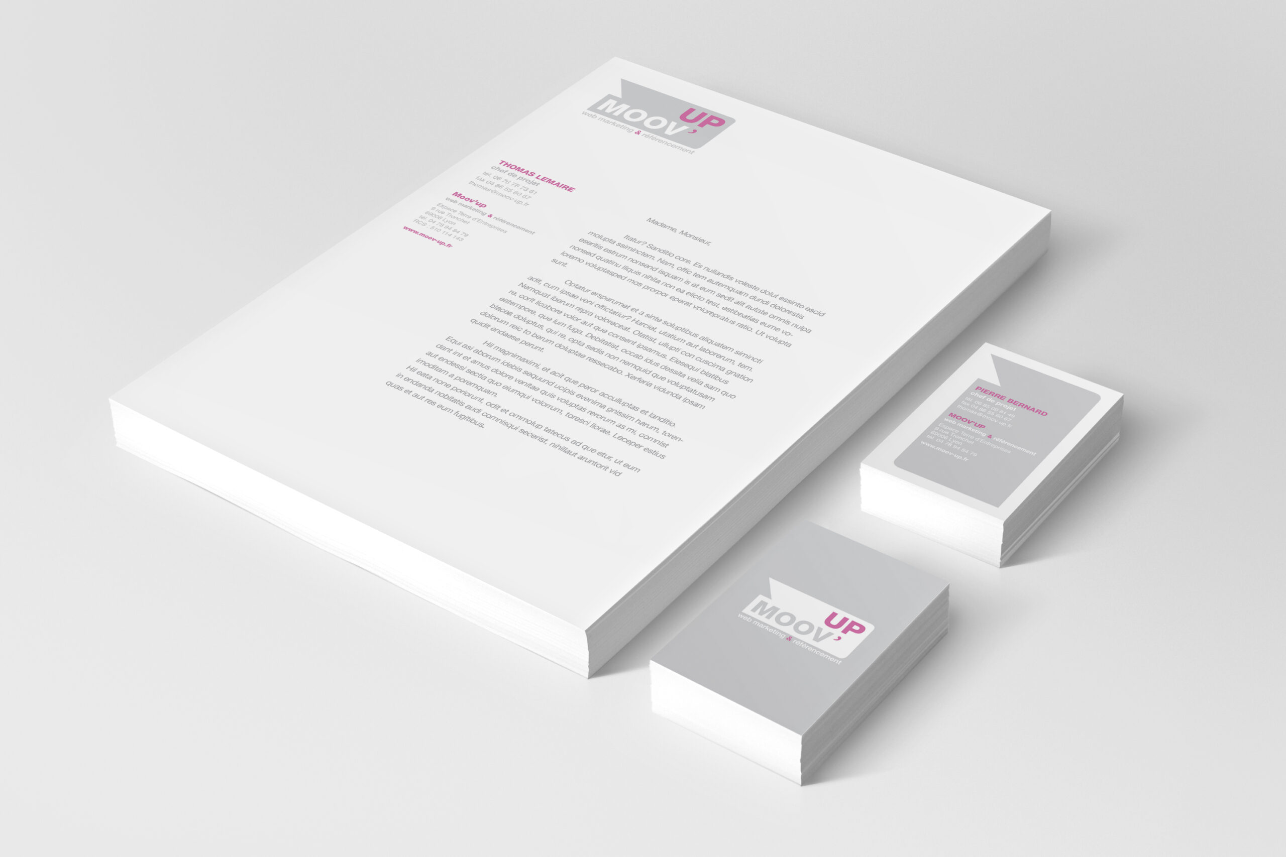
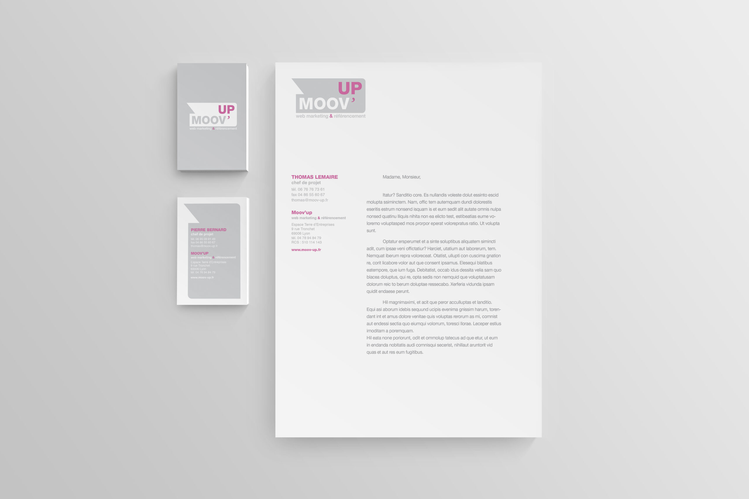
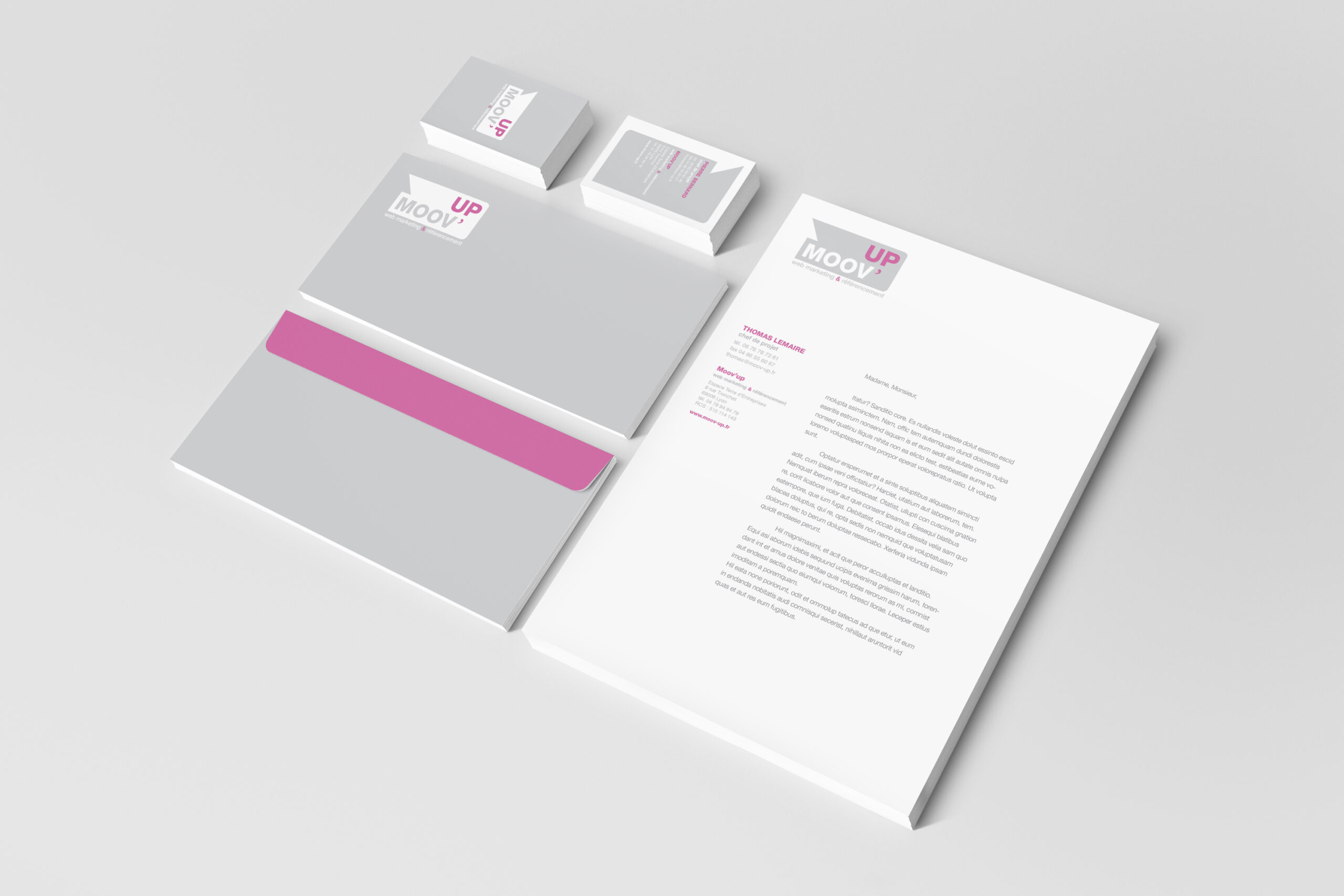
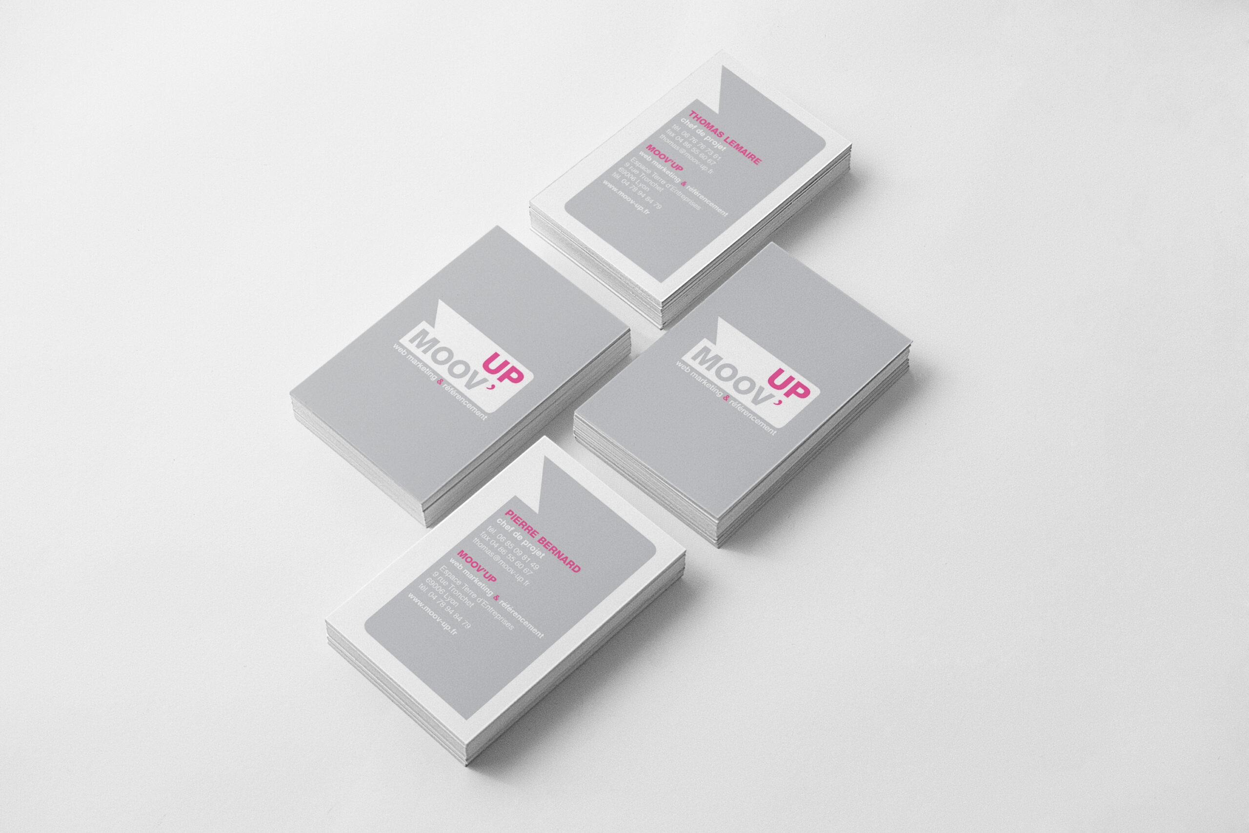
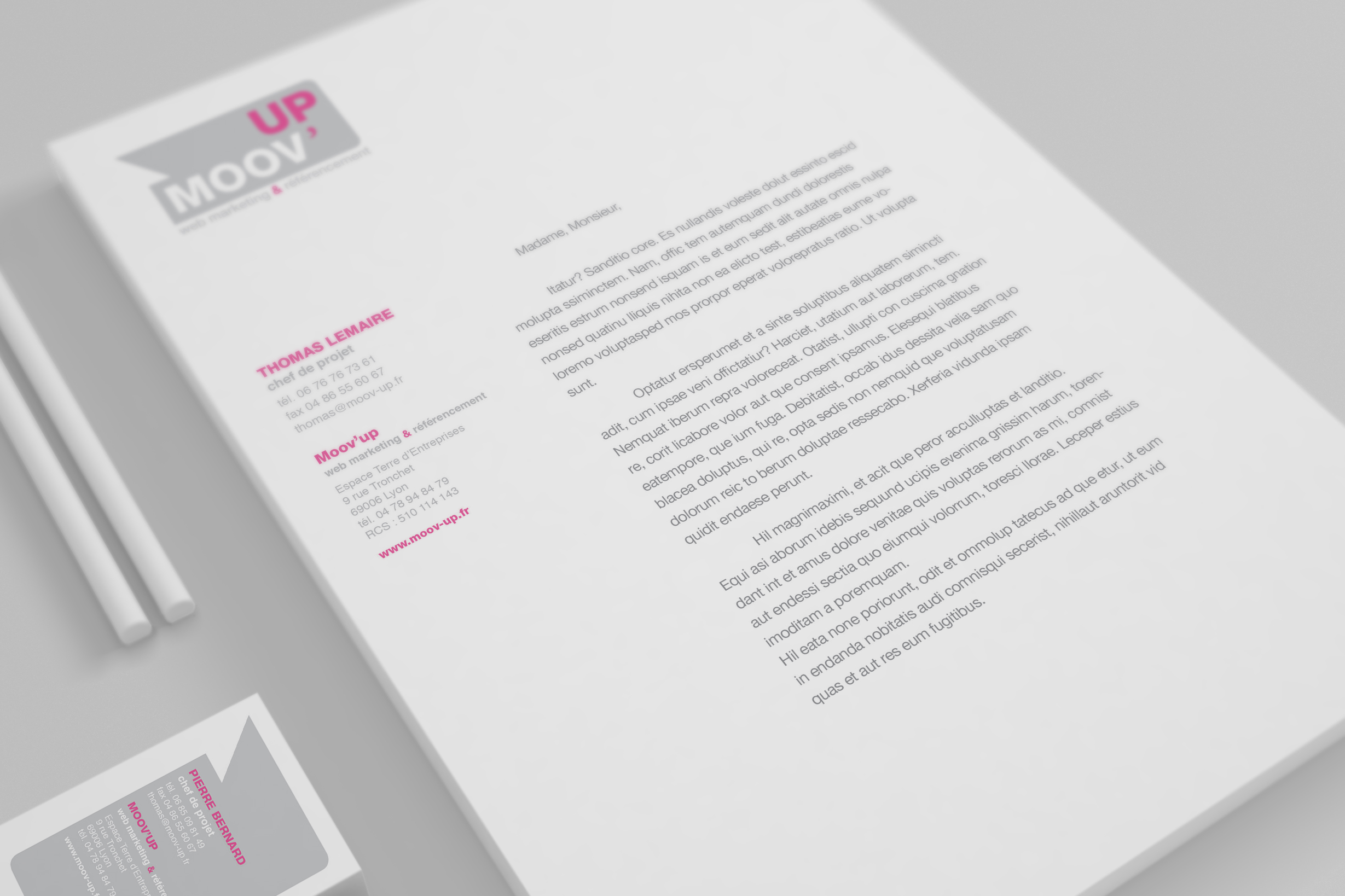
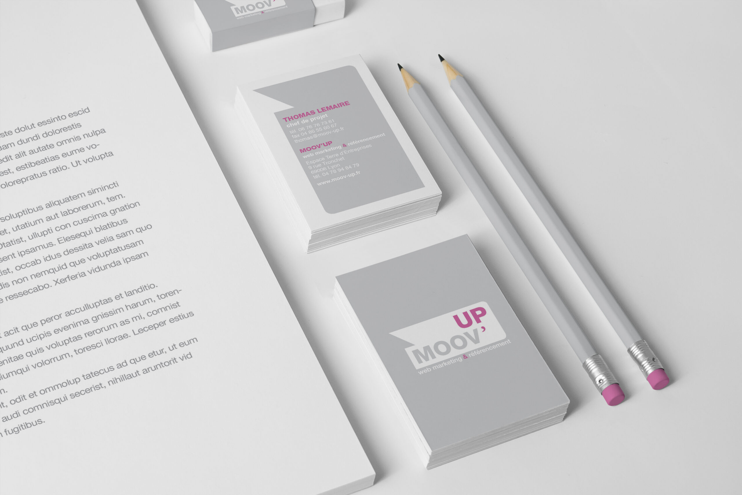
Création de l’identité graphique de Moov’Up, agence de web marketing et de référencement basée à Lyon. Le logotype intègre une flèche en contre-forme, symbole de progression et de performance. La palette colorée renforce le positionnement dynamique de l’agence.
Visual identity for Moov’Up, a Lyon-based web marketing and SEO agency.The logotype subtly reveals an arrow through negative space, a visual cue for growth and performance.A vibrant color palette enhances the brand’s dynamic and forward-thinking positioning.
We use cookies to enhance your experience while using our website. If you are using our Services via a browser you can restrict, block or remove cookies through your web browser settings. We also use content and scripts from third parties that may use tracking technologies. You can selectively provide your consent below to allow such third party embeds. For complete information about the cookies we use, data we collect and how we process them, please check our Privacy Policy